Case Study
Kiez Portal
The Ideas Engineering (ideas) is responsible for the initial concepts, also as a converter bringing them to the end products. We, as the product design team of ideas, became the main responsible for the internal innovation project — Kiez Portal.
Kiez Portal is the internal service platform for the Axel Springer campus in Berlin. The main purpose of this platform is to unify the most important services that were spread on a very heterogeneous IT landscape, in which our different departments were using to solve their individual needs.
The challenge was to cleverly integrate existing software that was already in place to create a user-centric, streamlined service platform that efficiently directed internal employees to the features they needed.

As the first phase of the design process – understanding user needs.
Since this was a cross-departmental project, we conducted a kick-off workshop by inviting all relevant stakeholders to take a more comprehensive overview of the requirements. After that, more individual workshops were held with each department in order to get more in-depth.
The invited stakeholders were from
1. IT department
2. People & Culture
3. Security & Intelligence
4. Co-Working
5. Service & Infrastructure
6. Pace, the catering department
During the workshops, we used user-centered design methods such as Personas and Scenarios to put ourselves in the shoes of different colleagues in the company and we identified the most important features and existing inconveniences for them through different perspectives. With the result, then we started brainstorming the most key features of the Kiez Portal, sorted the various implementation ideas into release stages, and decided together which features were needed for the Minimal Value Product (MVP), as following:
internal map of the new building
meeting room reservation
event date overview/ event calendar
lunch menu
catering service reservation
visitor reservation
After defining the key features, in order to determine the fluency of each feature for each persona, we worked with stakeholders to create the user flow shown below. In this process, we also developed different user stories to assist us in determining the touchpoints of these features, resolving user inconveniences, and meeting their needs.
The second phase of the design process — interface-focused solution
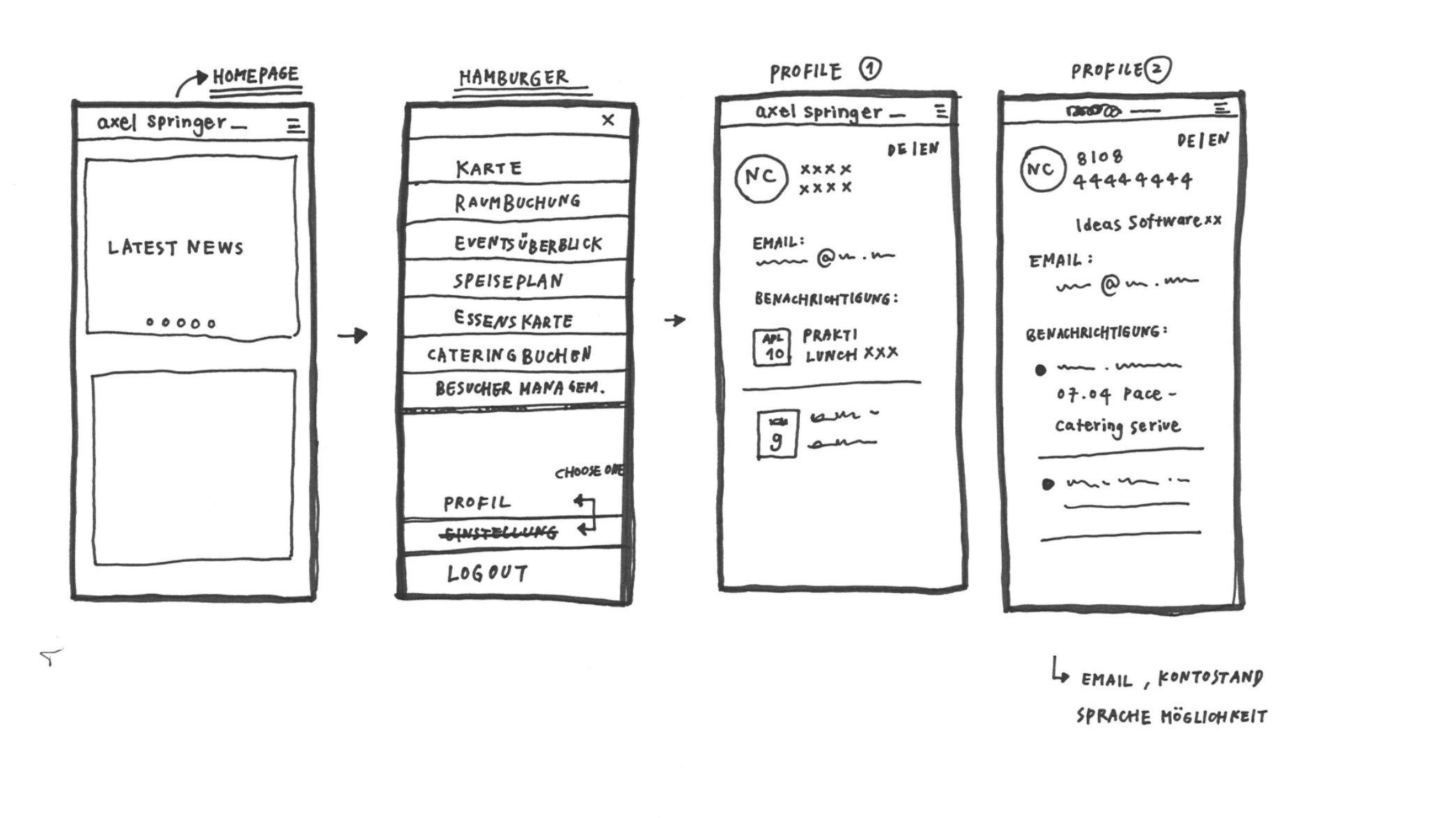
After the workshops with different stakeholders, we returned to the design team and started the next product design process. This helped us to define the hierarchy between features and to have a clear product overview. With the help of Information architecture, we started the first draft of the Kiez Portal.
The final product is shown in the picture. The style of the product was influenced by Bloomberg's main color scheme of black on white with the primary color blue. Primary colors were used to highlight the most important functions, such as buttons with calls to action, which was also in line with Axel Springer's updated CI in 2019.
The third phase of the design process — Task-tests
At Ideas, we followed the "test early and often" rule of user-centered product design. We tested the design in the mid-fidelity wireframe phase with 6 colleagues. Each test lasted an hour, during which we tested the main functionalities of our concept.
We divided the test into three sections:
First, the exploration phase, in which we asked users to look at the product and explain how they understood it. In doing so, we indicated whether there were things they particularly liked or things they found annoying.
Next, we conducted a usability test focusing on the room reservation, table reservation, and guest registration functions by asking users to perform tasks. This way we could determine if the functionality was inituitve, if users could perform the tasks without help, or if our design needed to be adjusted.
Finally came the debriefing. Here we gave users a moment to reflect on the test and to see whether the experience was satisfactory or not.
Overall, the feedback from users was very positive. One of the most important findings was that there were roles in our company that needed to book rooms for other colleagues, such as our executive assistants. This was not possible in our concept and was an important function for room booking.
Wrapped Up
As design team, we have developed a design system and functional concepts for multiple release phases. Our design process began in 2019, this product has been designed and developed continuously in a incremental way for more than 3 years since the beginning. And the UI design thinking has changed and grown a lot in the field of digital product design during this period. One of the biggest challenges was keeping the Kiez Portal consistent and evolving to meet user needs.
To achieve this, we followed gentle design updates to refresh the visual identity without completely changing it, and by aligning stakeholder requirements with actual user needs.
Team UX, Dec. 08, 2022

Want to know more about UX?
Team UX provides support at various stages of the product design process.


